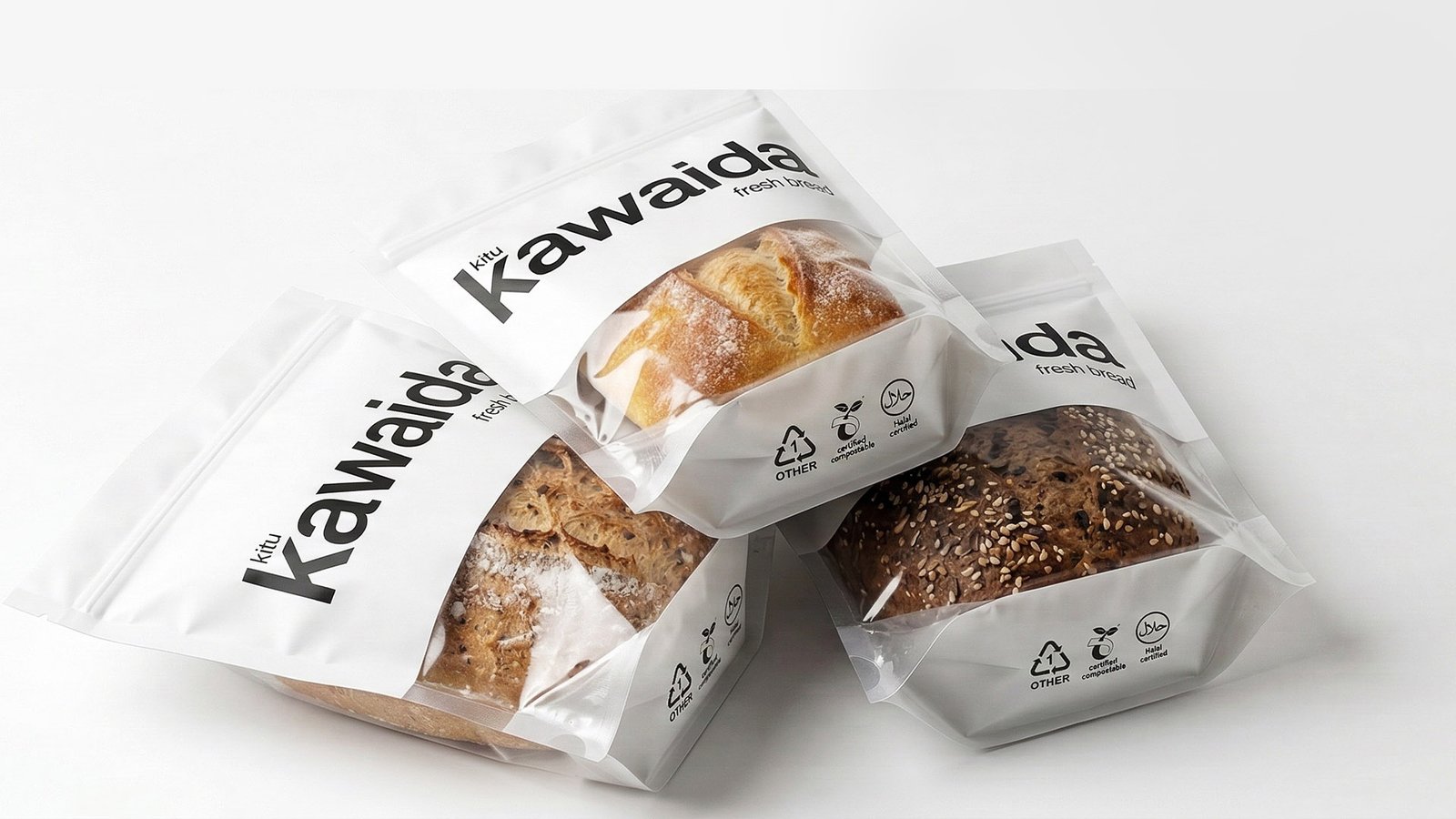
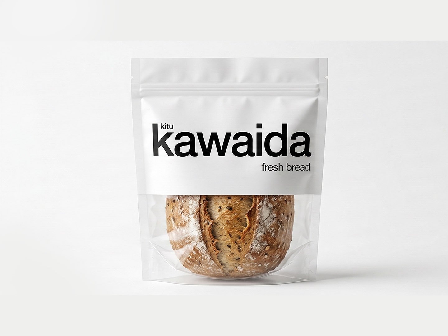
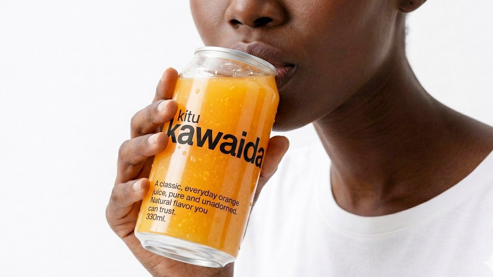
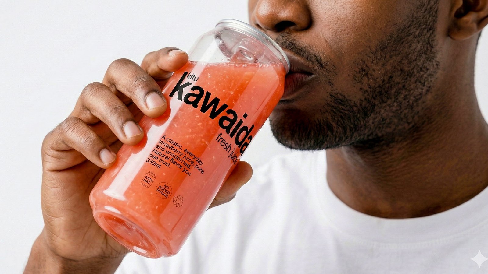
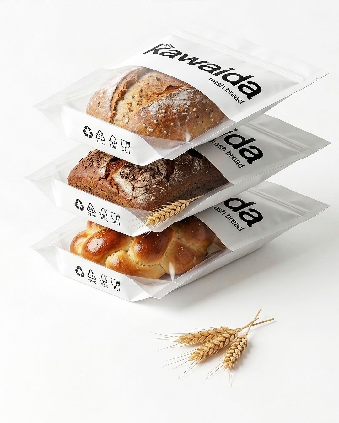
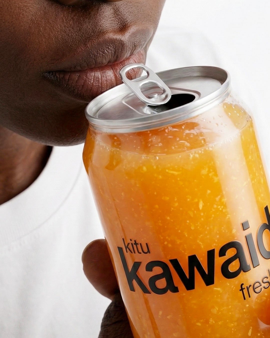
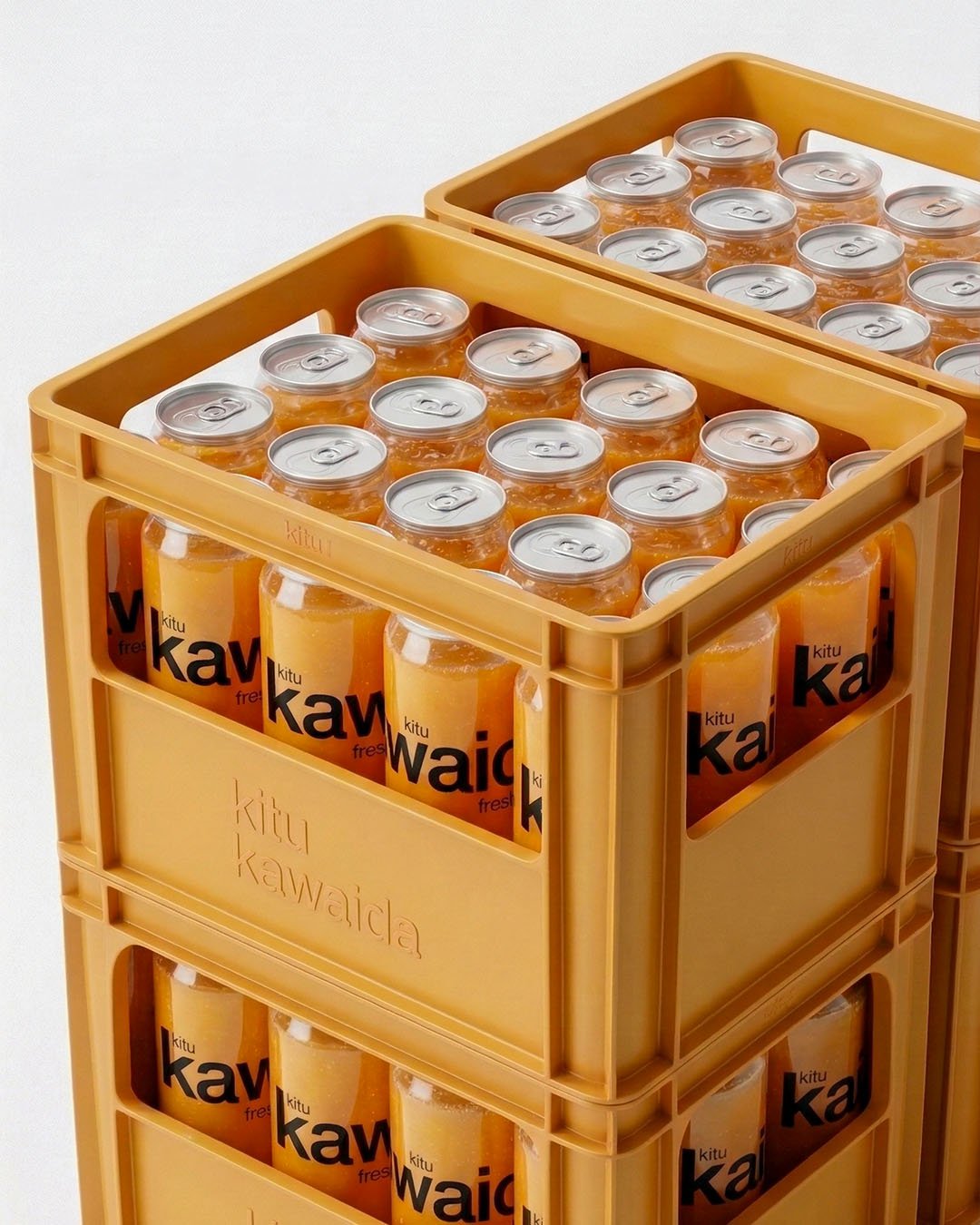
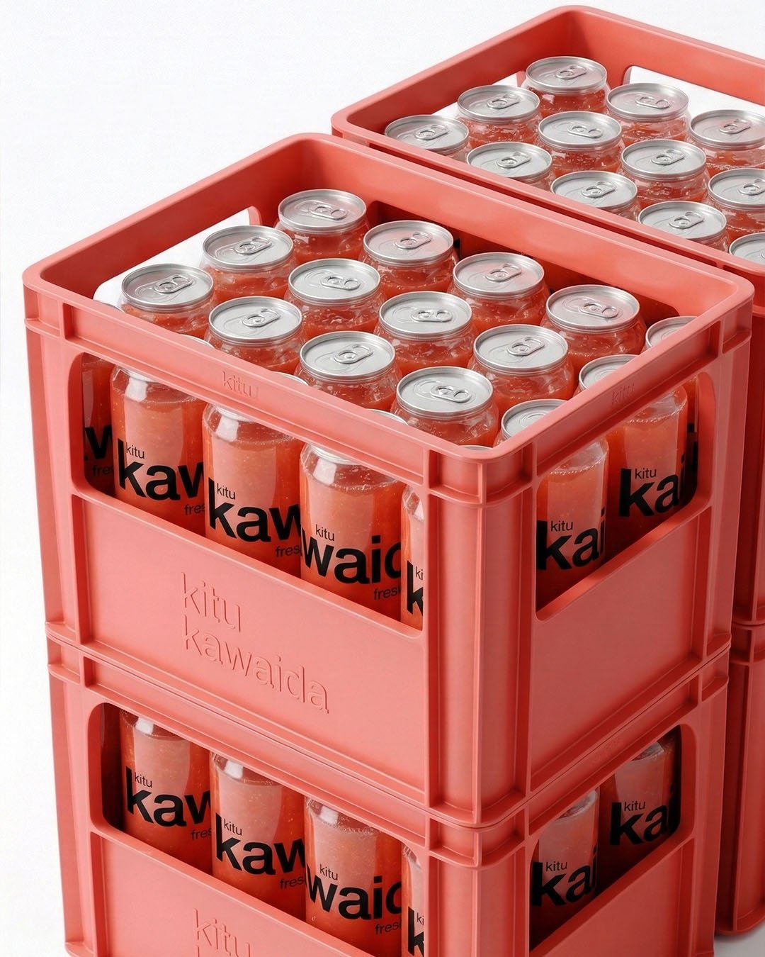
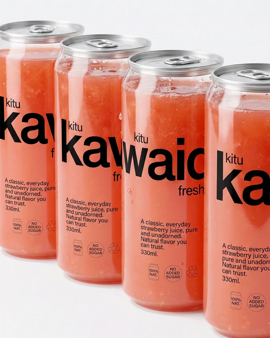
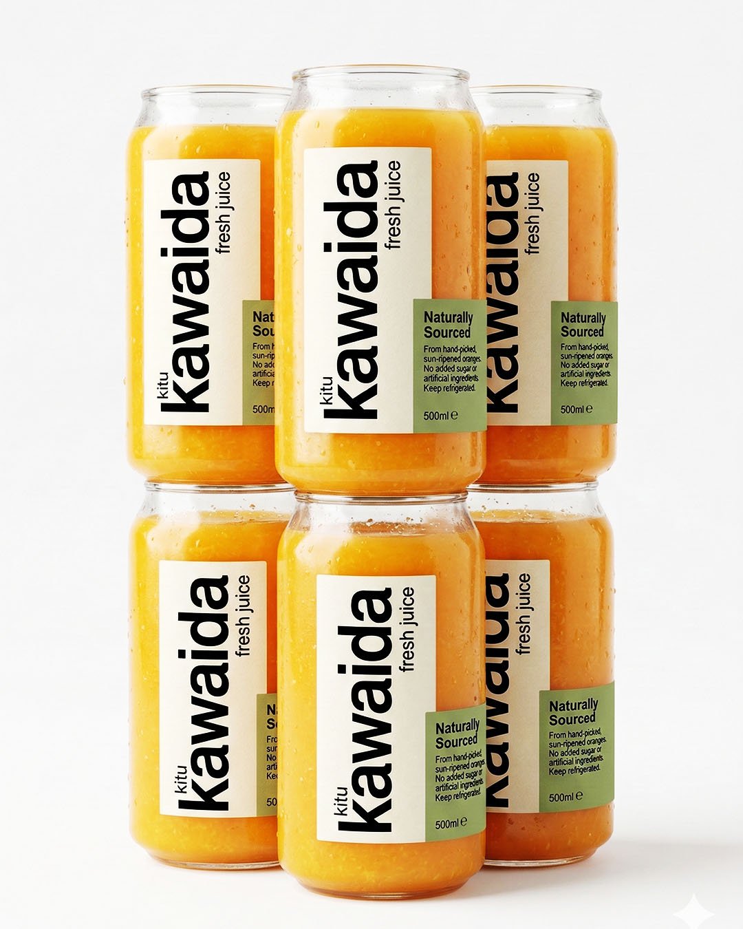
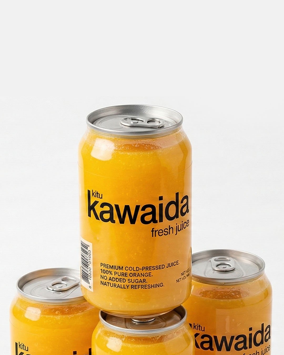
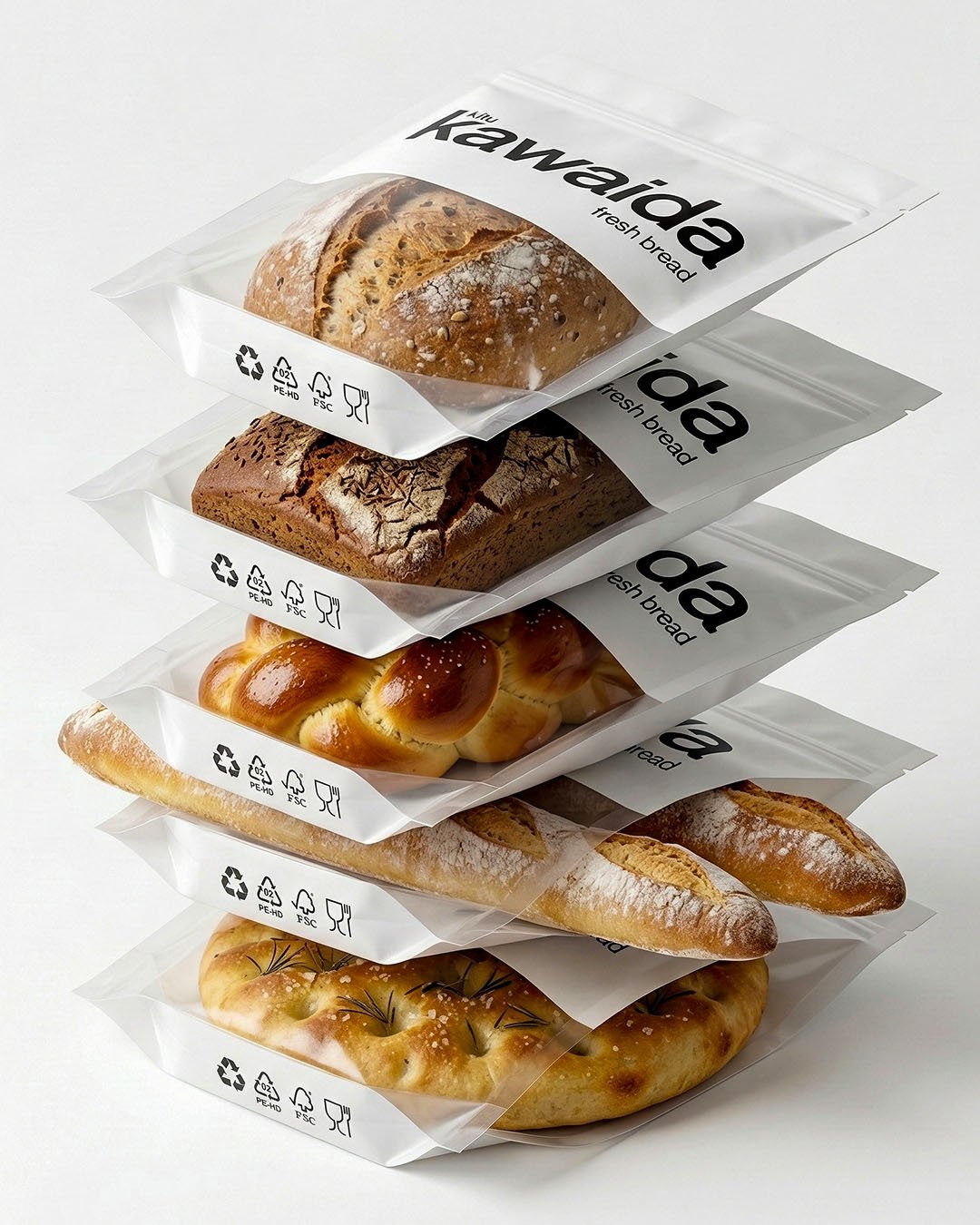
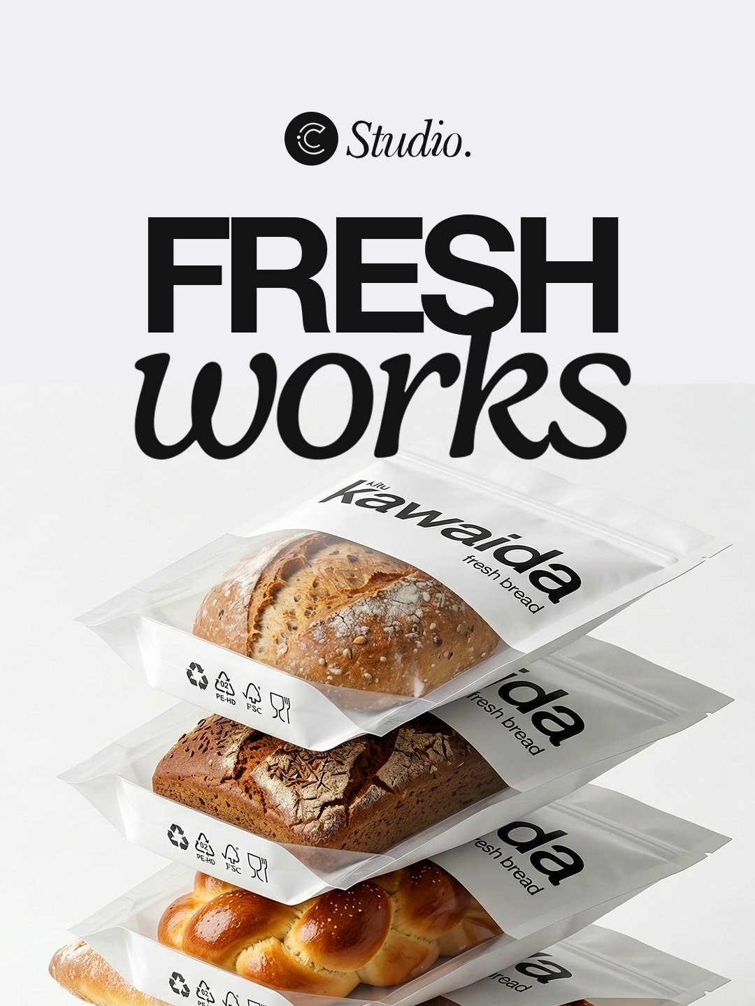
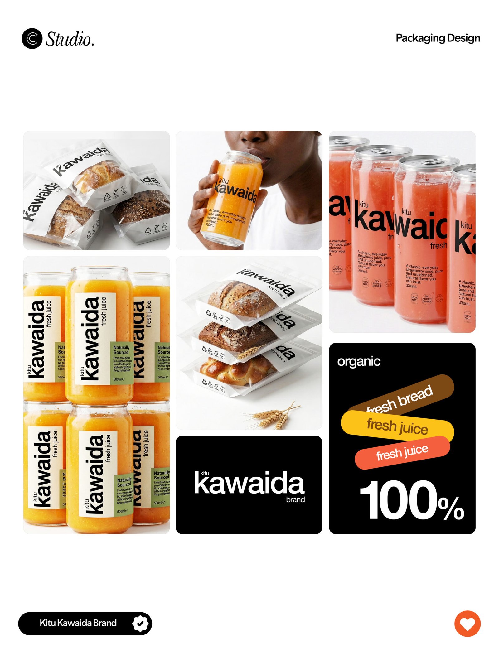
The Kitu Kawaida packaging design concept explores how extreme simplicity can become a powerful branding tool. Kitu Kawaida, a Swahili phrase meaning “Just Normal,” inspired a minimal design approach where the packaging for the bread and natural juice products relies solely on clean typography and the brand name, without additional illustrations, graphics, or decorative elements. By stripping the design down to its most essential component — the name itself — the concept highlights the honesty and everyday nature of the products while creating a bold visual identity through minimalism. This project by Cchora Studio demonstrates how thoughtful packaging design, minimalist branding, and typography-led design can transform something ordinary into a memorable brand experience, proving that sometimes the simplest idea can make the strongest impact.