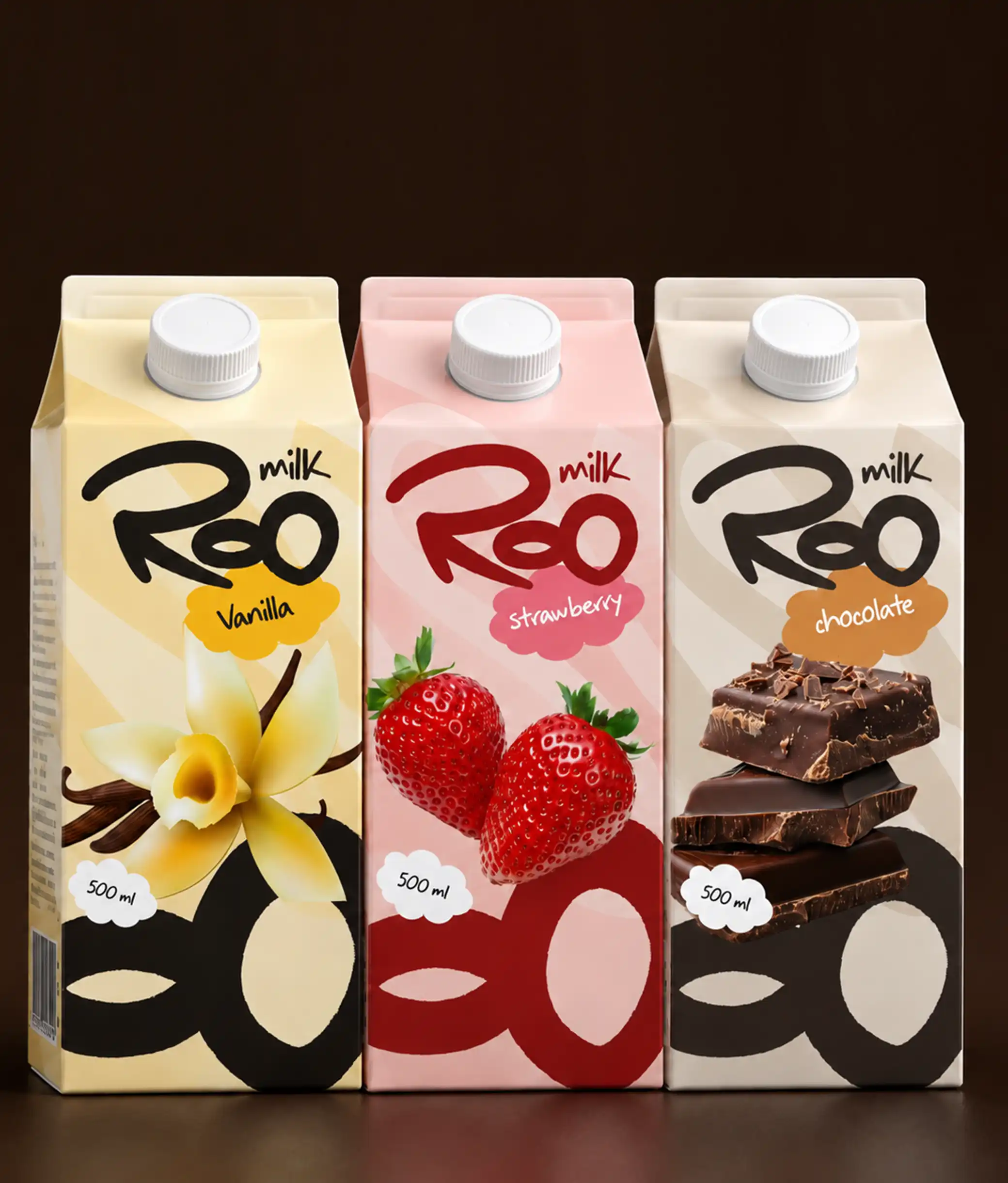
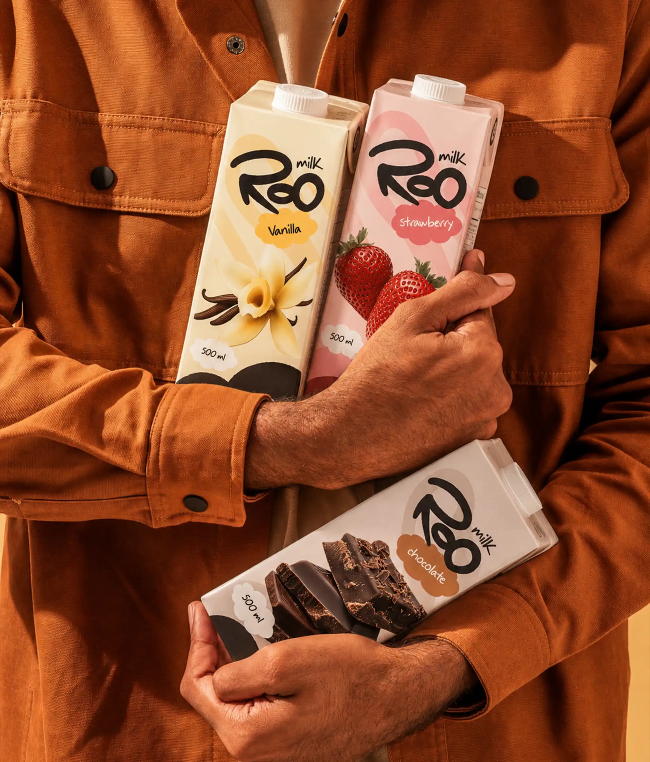
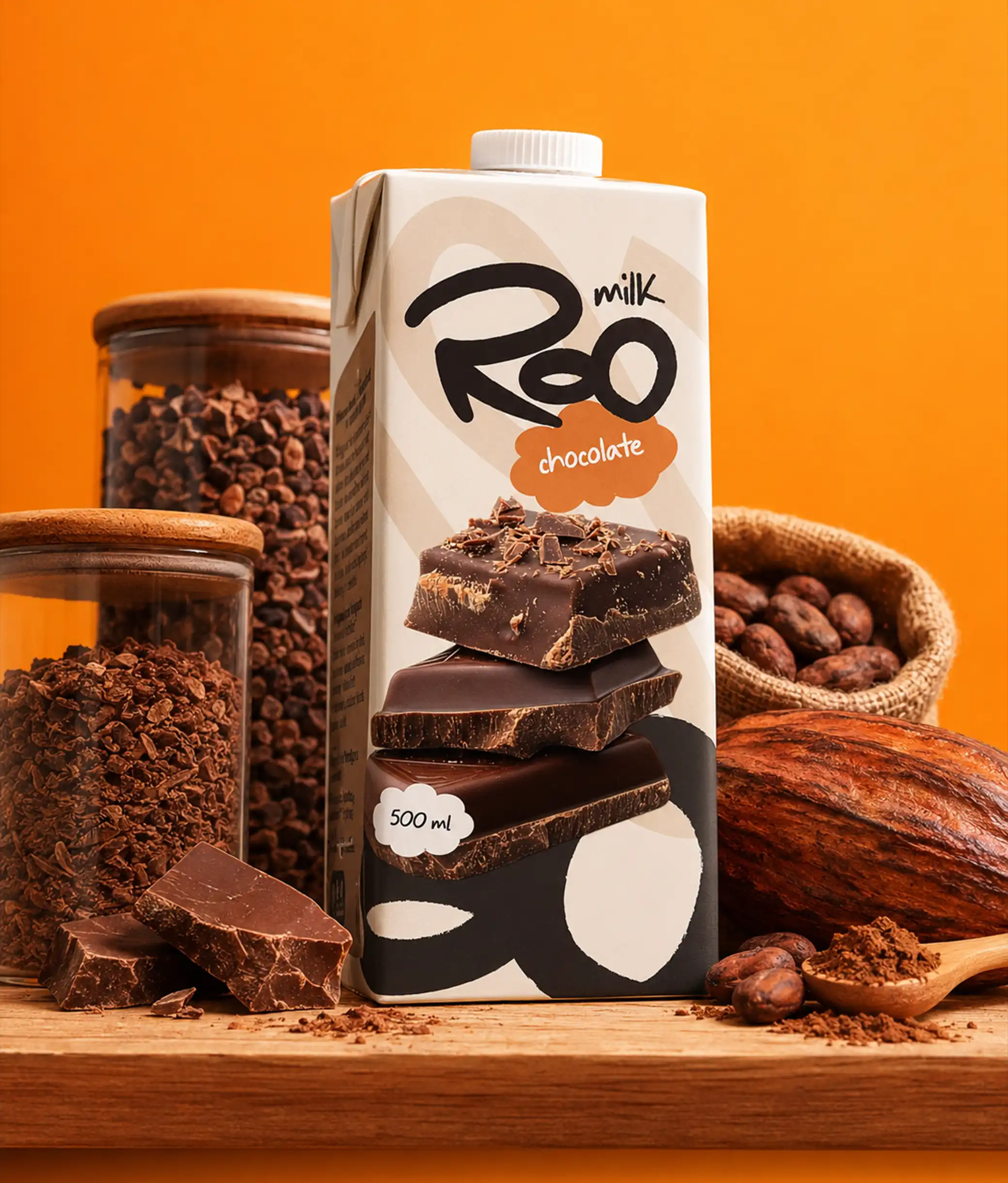
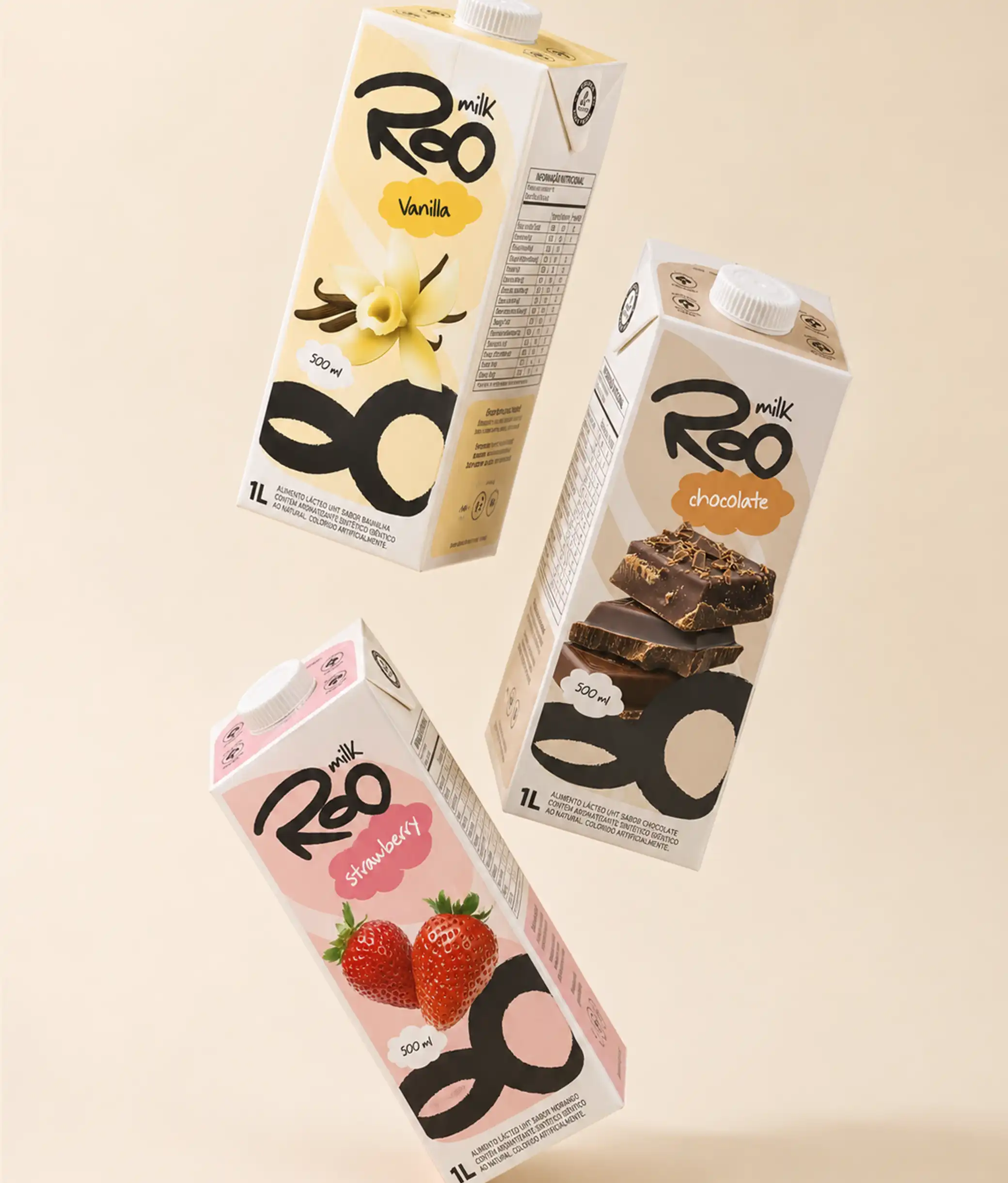
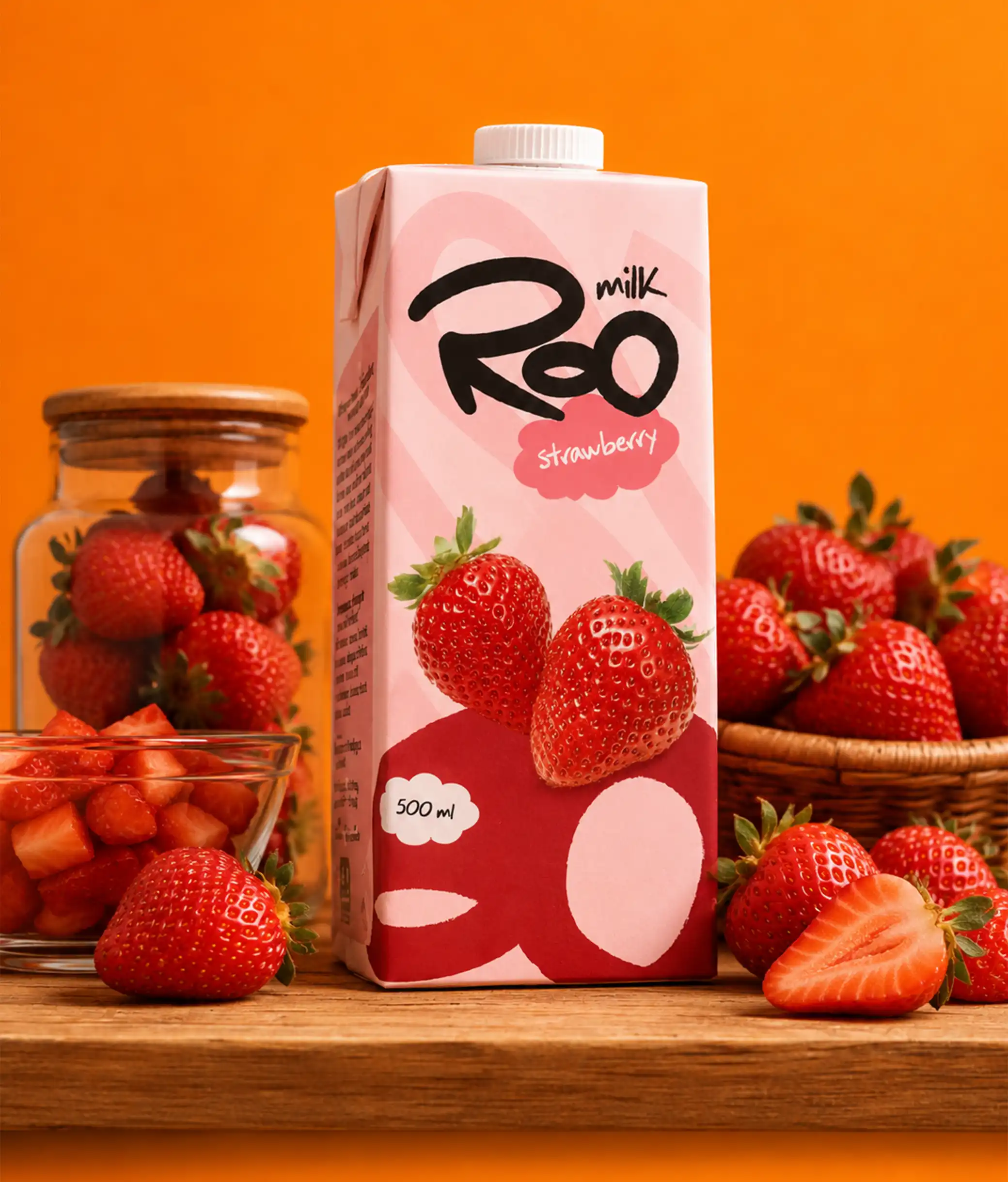
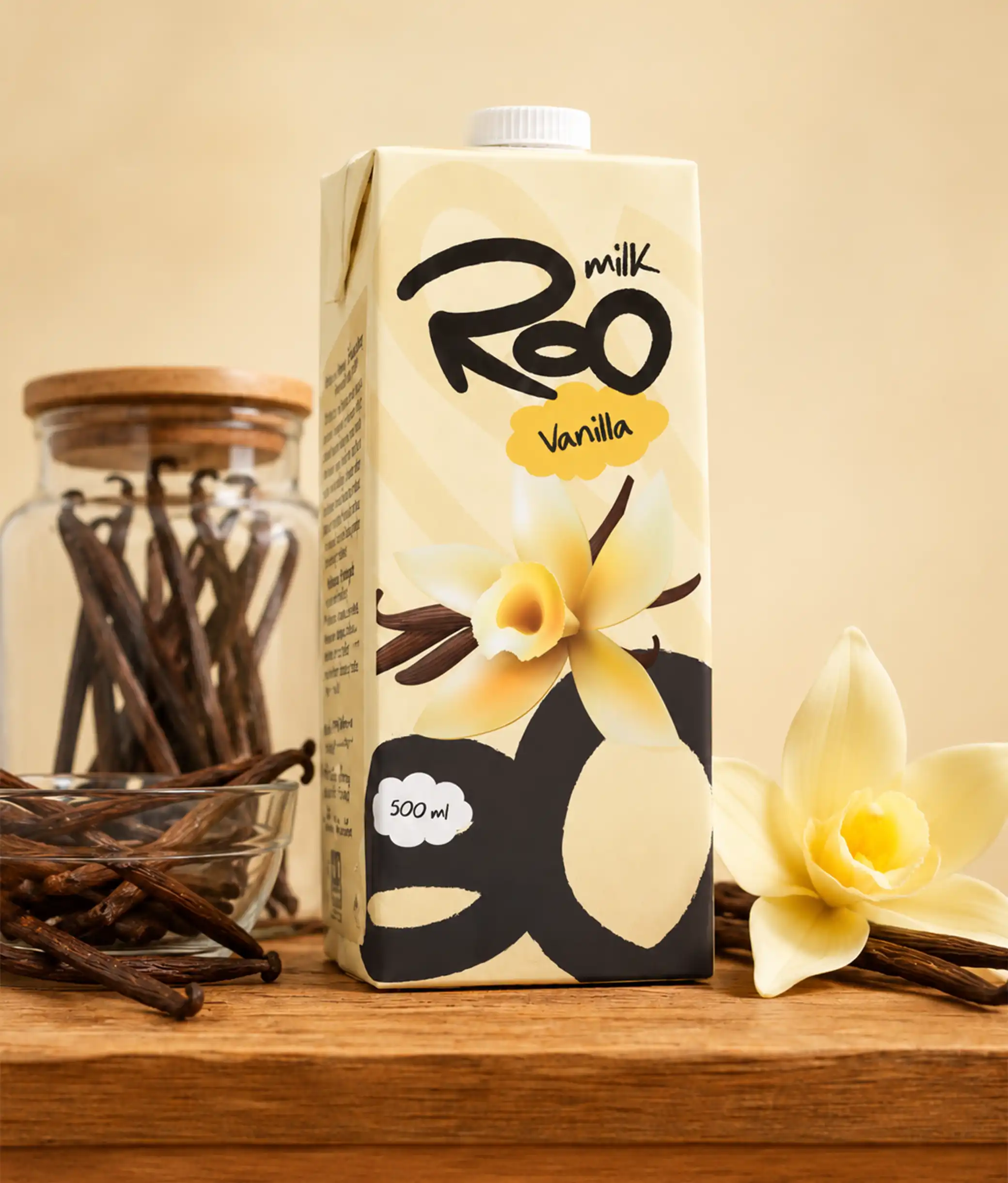
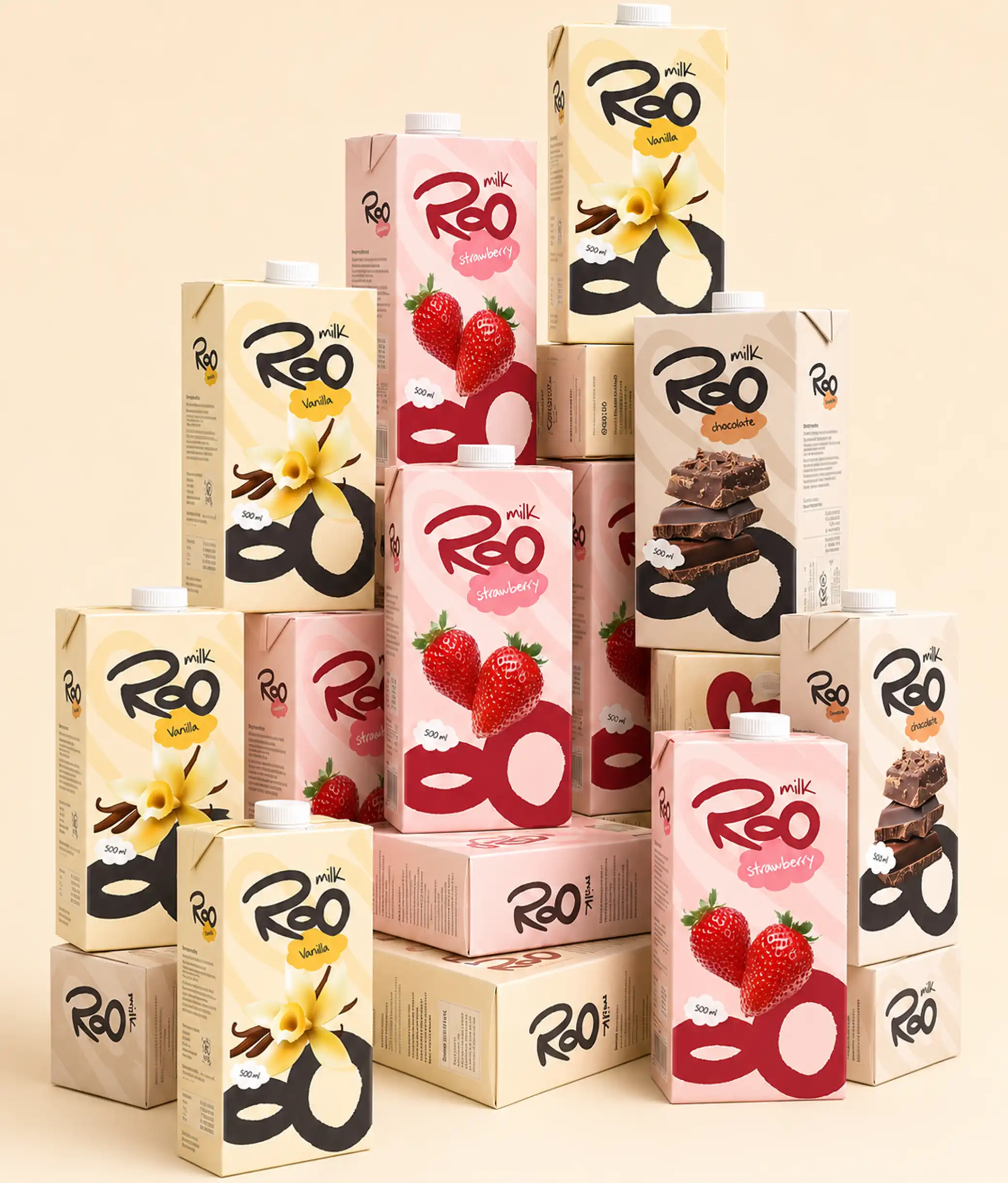
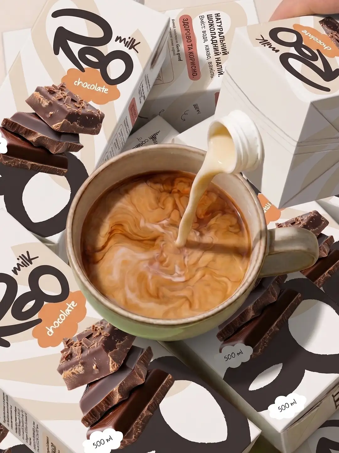
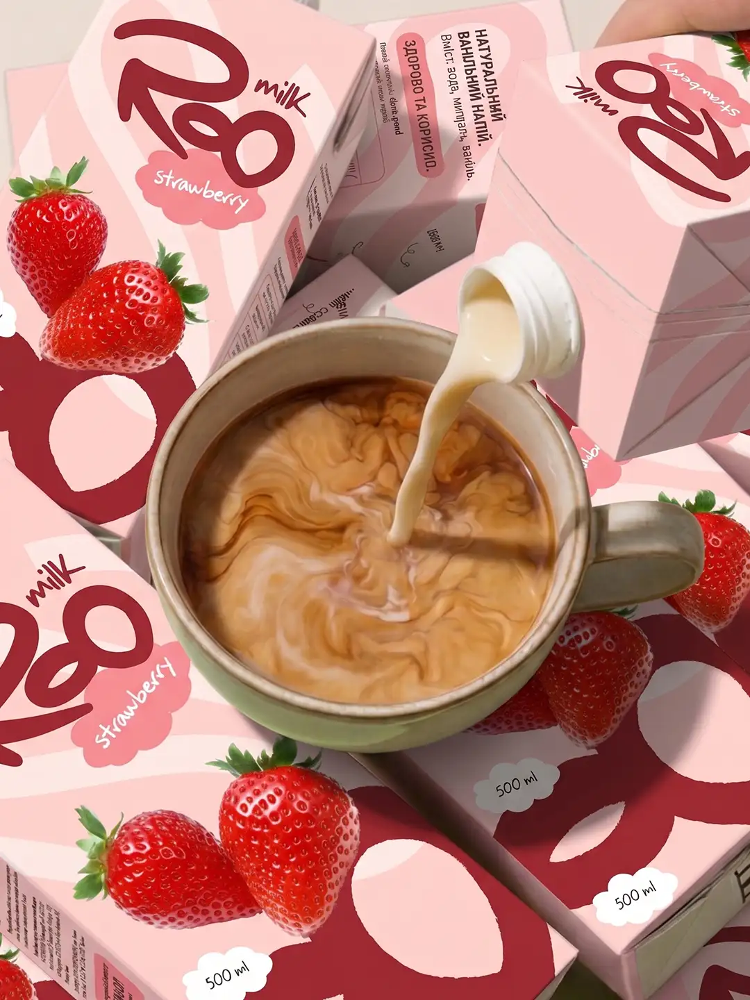
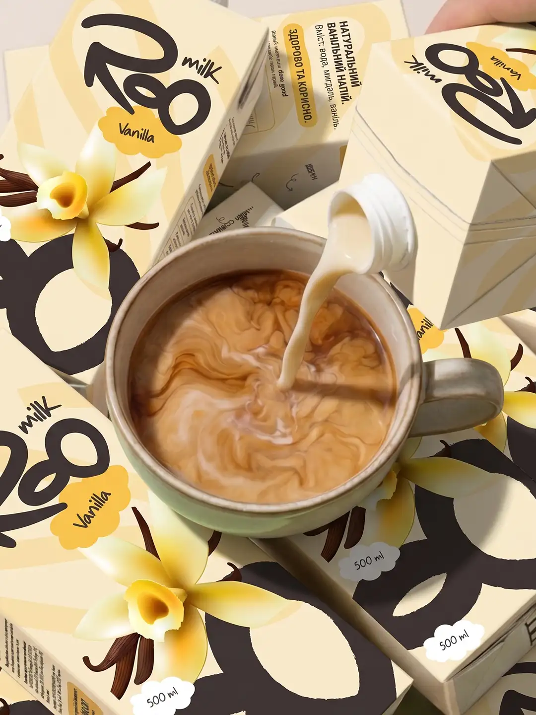
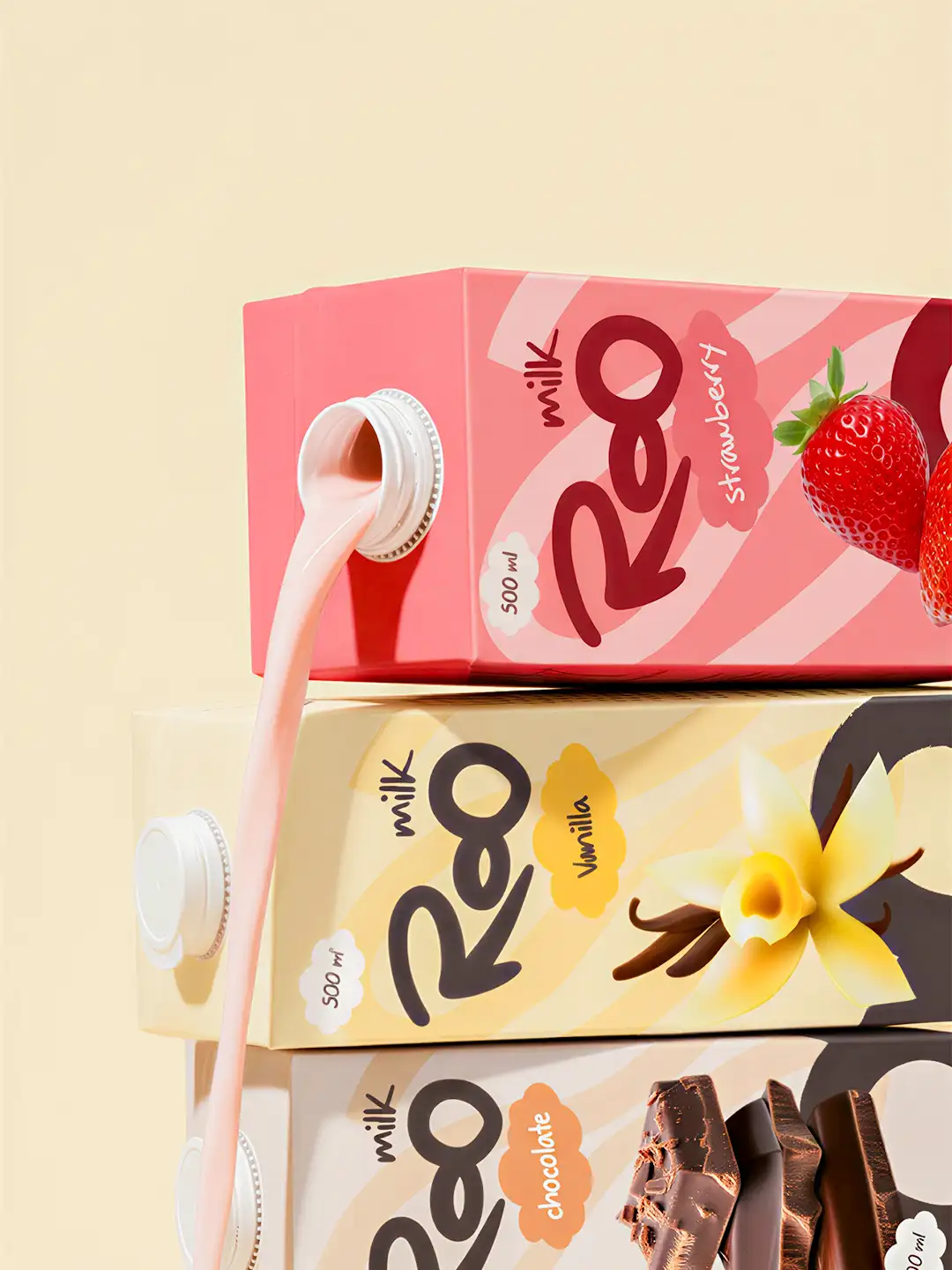
For the Roo Flavoured Milk packaging design, we created a bold, playful and shelf-ready visual identity that brings each flavour to life while keeping the brand instantly recognizable. The packaging is built around a hand-drawn Roo Milk wordmark, expressive brush-style graphics, soft pastel colour palettes, and flavour-led illustrations that make each variant feel fun, fresh and memorable. For Vanilla, we used warm cream and yellow tones with vanilla flowers and pods to communicate smoothness and sweetness; for Strawberry, we introduced soft pinks, rich reds and vibrant strawberry imagery to create a fruity, youthful feel; while Chocolate uses warm beige and brown tones with layered chocolate visuals to signal richness and indulgence. Across all packs, the cloud-shaped flavour labels, bold abstract shapes, and clear 500 ml callout create a consistent packaging system that is eye-catching, easy to navigate, and designed to stand out across retail shelves, product photography, and digital brand campaigns.