Objective: To establish a fresh, modern brand identity for PATCO Mints that appeals to consumers looking for premium, refreshing mints.
Challenge: PATCO Mints aimed to differentiate itself in a competitive market dominated by long-standing brands. The company needed a brand identity that would highlight the freshness and quality of its mints, targeting a young, trendy audience.
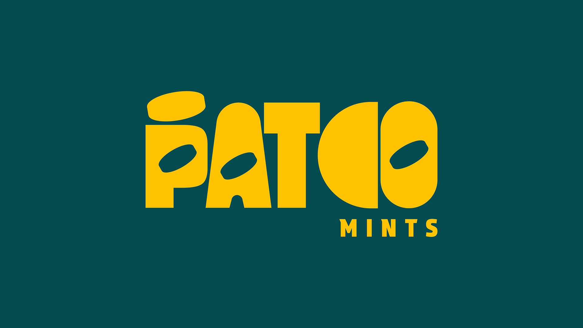
Solution: Our team at Cchora developed a sleek and minimalist brand identity for PATCO Mints. We chose a cool color palette featuring minty greens and crisp whites to evoke freshness and purity. The logo design was modern and straightforward, emphasizing clarity and approachability. For the packaging, we used a clean, simple design with bold typography to make the product stand out on retail shelves and be instantly recognizable.
Outcome: The rebranded PATCO Mints successfully captured the attention of the target market, leading to increased brand recognition and sales. The minimalist design and fresh appeal of the packaging have also spurred positive discussions on social media platforms, further enhancing brand visibility and consumer interest.
- Branding
- Visual Identity